Quick AWS Amplify Studio
1 Using Amplify UI
npx create-next-app
cd myapp
amplify pull --appId XXXXXXXXX --envName staging
Amplify AppID found: XXXXXXXXXX. Amplify App name is: demo
Backend environment staging found in Amplify Console app: demo
? Choose your default editor: Visual Studio Code
? Choose the type of app that you're building javascript
Please tell us about your project
? What javascript framework are you using react
? Source Directory Path: src
? Distribution Directory Path: .next
? Build Command: npm run-script build
? Start Command: npm run dev- This will create a
model/andui-components/in yoursrc/folder - This will create a
amplify/in your root folder
2 Understanding Amplify Studio
2.1 Component vs Child
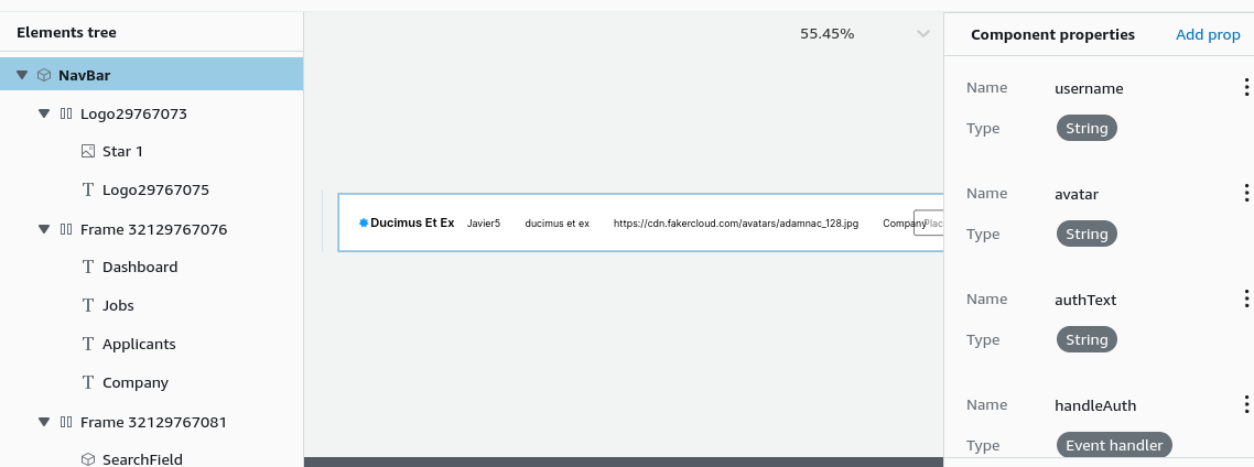
Observe the “Component properties” sidebar correspond to props and typescript types
export default function NavBar(props) {
  const { username, avatar, authText, handleAuth, overrides, ...rest } = props;
  return...
export declare type NavBarProps = React.PropsWithChildren<Partial<FlexProps> & {
username?: String;
avatar?: String;
authText?: String;
handleAuth?: (event: SyntheticEvent) => void;
} & {
overrides?: NavBarOverridesProps | undefined | null;
}>;- Press “Add Prop” next to “Component properties”.
- Name: “username” <– this is the prop variable name as shown in the codeblock above (Can name it anything)
- Type: String <– this is the Type that is given to our typescript file
using the AmplifyUI components
import { Amplify } from "aws-amplify";
import { studioTheme } from "../ui-components";
import { AmplifyProvider } from "@aws-amplify/ui-react";
import "@aws-amplify/ui-react/styles.css";
// import "@fontsource/inter";
import '@/styles/globals.css'

import awsconfig from "../aws-exports";
Amplify.configure(awsconfig);

export default function App({ Component, pageProps }) {
  return (
<AmplifyProvider theme={studioTheme}>
  <Component {...pageProps} />
  </AmplifyProvider>
  )
}
import NavBar from '@/ui-components/NavBar'
export default function Home() {
return (<>
<NavBar username="none" avatar="none" authText="Hi" handleAuth={() => {console.log("hi");}} />
</>) }2.2 Hero example
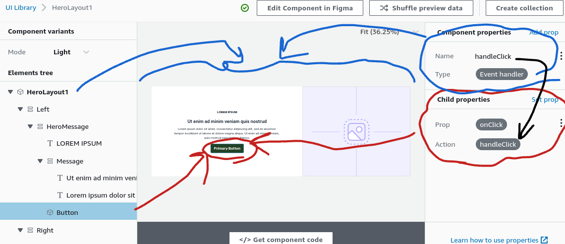
- In this Hero example, the Component refers to the HeroLayout1, aka the Entire thing
- The Child, refers to the “Button” which we have selected on the left Elements tree sidebar.
In this case we set our “handleClick” callback via our HeroLayout1.
The Child aka button when clicked will call the HeroLayout1’s “handleClick” callback function.
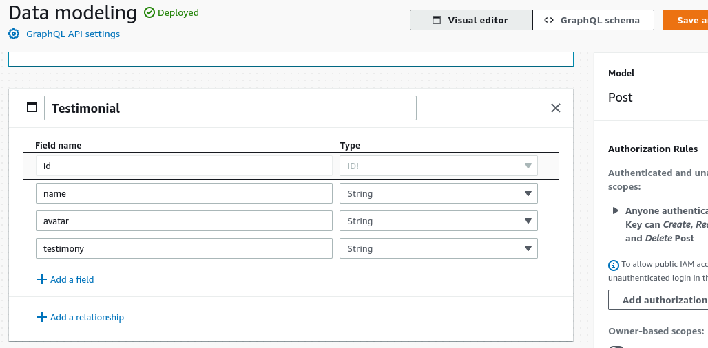
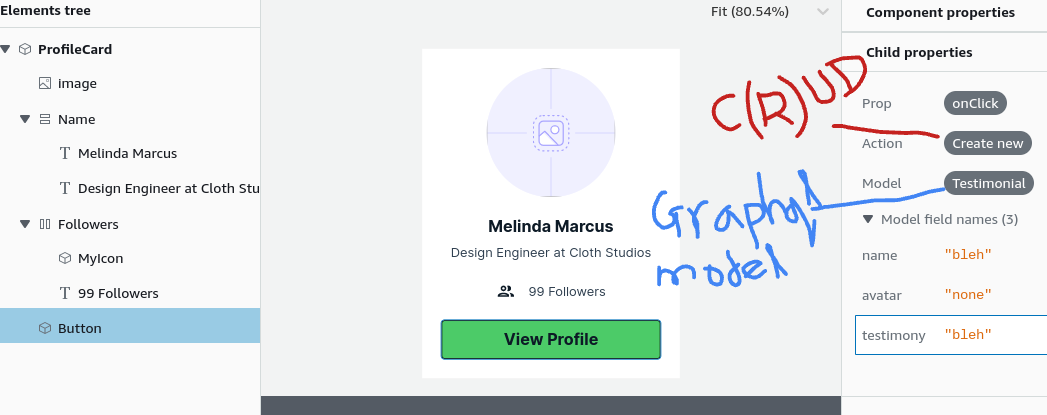
3 GraphQL CRUD Component integration
- Amplify Studio native C(R)UD dynamoDB integration with it’s graphQL appsync models.
- Is it free? Well it’s actually deployed in your AppSync function using a VTL runtime(as opposed to lambda runtime), so no
4 Authenticator hook
import {  withAuthenticator } from '@aws-amplify/ui-react';
function Home() {return (<div>Home</div>)}
export default withAuthenticator(Home)
5 Upgrading Amplify Figma UI components
Understand that “primitives” in figma are things like buttons, text boxes which the AWS team modifies but the user should NEVER touch.
The user modifies “components” in figma which are combinations of “primitives” in figma.
Upgrading Amplify UI components == Upgrading “primitives” in Figma (we upgrade by copying the updated “primitives” into our Amplify UI project while keeping our custom components)
- Go to https://www.figma.com/community/file/1047600760128127424
- Click “Get a copy”
- Delete your Primitives page in your custom Figma UI
- Make a new page called Primitives
- Shift+Select Primitives in the Updated Amplify UI Figma , Primitives pages
- Should highlight “Icon, Alert, Card,….Button, Rating, Badge”
- Ctrl+C copy then Switch tabs to your custom figma “Primitives” page and Ctrl+V paste
- Should highlight “Icon, Alert, Card,….Button, Rating, Badge”
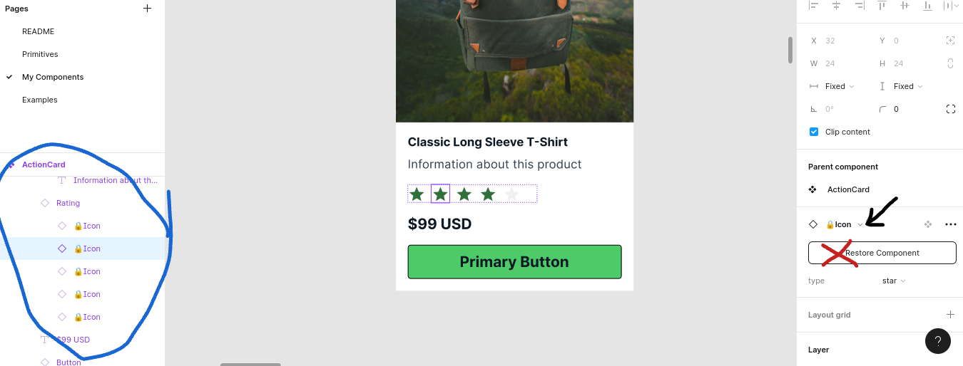
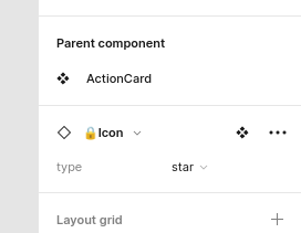
- The red X mark indicates the component is NOT connected. (Do Not Click “Restore Component”, it will just copy the primitive into your component page).
- Click the dropdown, the search for “Icon”, then select it.
You will have to do this for ALL Components in your components list. Use the area circled in BLUE to help find “primitives” that your component uses.
KNOW: This is tedious and there is no way around it !
6 Building your own component
- Hit “f” to frame-building, then drag a rectangle frame
- Right-click >> Create component
- Select component frame, Navbar >> Click Resources >> Primitives >> Button
- Optional , Right click frame >> Main Component >> Add variant